I’m a pretty visual being, and today has been a feast for my soul.
Whilst writing our weekly newsletter, I came across a bunch of awesome stuff around mapping and visualisations. Which I’m going to share (warning: short blog post due to encroachment of Friday arvo beer o’clock).
In order of discovery, then:
Infographics
Did you know that Barack Obama’s SOTU 2011 address was released in an enhanced (i.e. containing infographics) version? I certainly didn’t, but it’s a fascinating way to watch the talk, and gives some great context
[youtube]http://www.youtube.com/watch?v=kl2g40GoRxg&feature=player_embedded[/youtube]
There’s also some quite interesting conversation around the infographics used. Those who care about such things might, for example, be a little unimpressed about the bubble chart… Still, well worth a squizz*!
And, still looking at SOTU addresses over the years, but somewhat differently: a parsing tool! Basically, you can look at how often certain words (picked by yourself or the programme) crop up in said addresses over the years. Good fun, this. And yes, it focuses on George W Bush’s years in office: interesting to note, for example, how often ‘terror’ comes up, and how little ‘hope’.
Maps
SEED has published a rather enthralling article on mapmaking. Much as I love maps, I’d hardly say I know much about the subject (now doubt there’s a pun in there somewhere), so I found it both educational and thoughtprovoking.
For example, I’d never seen the map below: made in 1869 by Charles Joseph Minard, it maps both in time and space the advance and subsequent retreat of Napoleon’s disastrous 1812 march through Russia.

It’s a pretty clever map, making use of at least six, distinct types of information.
Of course, it’s not just about mapping events and phenomena. There’s increasing interest, and work being done in, mapping interactions and even knowledge itself. Which is where the article starts to talk about a new book, Atlas of Science: Visualizing What We Know**, by Katy Borner.
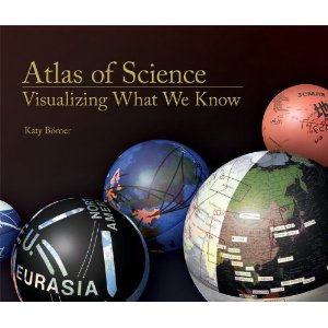 In essence, it talks about how science itself is beginning to be mapped by people in a beautiful example of real interdisciplinarianism: designers, cartographers, cognition specialists, historians and the rest. I won’t bother regurgitating the article here, but it’s well worth a read, if nothing else for its explanations of some of the limitations faced by the endeavour.
I love this kind of stuff. It helps us far better understand our surroundings, both real and virtual, and in better understanding them, we can better navigate and draw use and value them. Something very much to be desired.
Also, they’re pretty :)
P.s. Check out other awesome data vis work on fellow sciblogger Chris McDowall’s blog, seeing data.
——————-
* Squizz: look/view
** I lust after this book, and shall try and get a review copy of it… Feel like helping out, MIT Press?
Pingback: World Spinner()