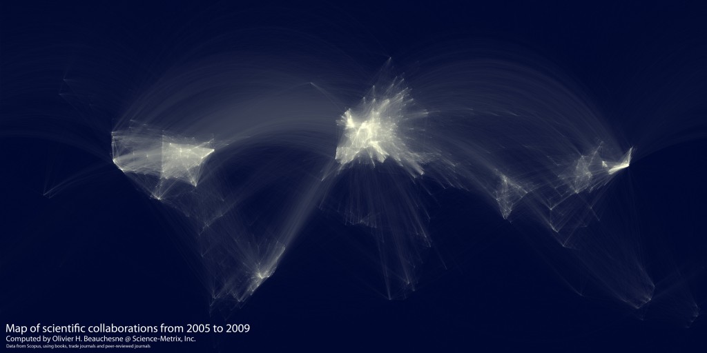
Following my last post, which talked about work which has been done ranking the excellence of scientific organisations around the world, there’s this: a map of scientific collaboration between researchers.

Developed by Olivier H. Beauchesne, who makes really interesting data-visualising maps, it looks at scientific collaboration between cities (and their researchers) all over the world.
As Oliver puts it:
For example, if a UCLA researcher published a paper with a colleague at the University of Tokyo, this would create an instance of collaboration between Los Angeles and Tokyo. The result of this process is a very long list of city pairs, like Los Angeles-Tokyo, and the number of instances of scientific collaboration between them. Following that, I used the geoname.org database to convert the cities’ names to geographical coordinates.
From there, he used a Mercator projection, and the Great Circle* algorithm to trace the collaboration between cities. As you’ll see, the data vis works beautifully and intuitively - just by looking at it, you can tell that the brighter the lines, the more collaboration there.
And, because I know my Kiwi readers will immediately look for it - we’re there. And not completely invisible, either :) Hooray!
Go have a look at the original post (and Oliver’s blog in general!), which also has a links to high-res versions of the map.
—-
Related note: the awesome Shaun Hendy’s book Get Off The Grass was launched last week. With Paul Callaghan as co-author, the book speaks about the huge importance of diversifying our economy away from its heavy reliance on the primary industries, with tech and innovation as viable, logical ways of doing so.
—-
* Which I am now going to go and look at, immediately :)