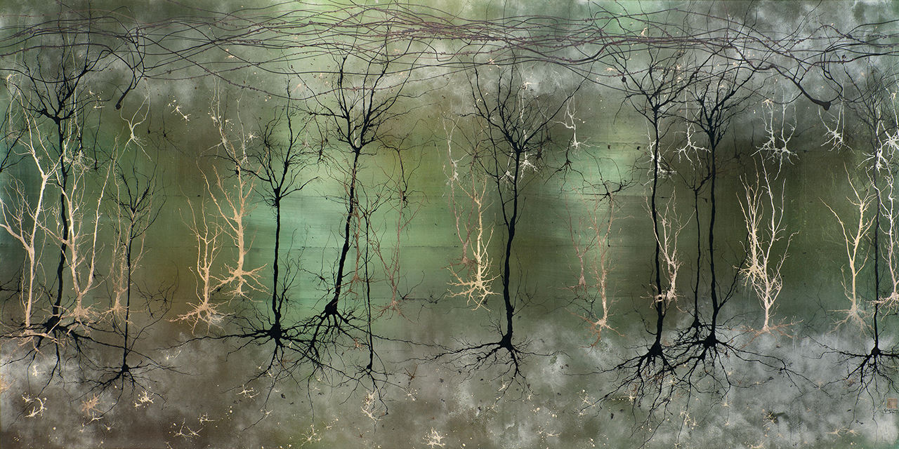
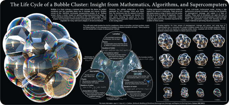
And my goodness but there are some stunners this year.
As readers of this blog will know, I’m something of a fan of data visualisation, and this year’s competition winners have a great deal to offer, in categories from games to video, posters and more.
It’s difficult to pick a favourite, but I did want to highlight the video below as one of them. Produced by NASA and winner of the video category, it shows the beautifully intricate and dynamic relationship between Sol (our sun) and Earth. How it affects our climate, the effect of coronal mass ejections, and more.
[youtube]https://www.youtube.com/watch?v=6hD52H7rQak[/youtube]
Of course, there’s plenty more on which to feast your eyes! Arstechnica has picked out a collection of the competition’s winners, and Science (one of the organisations behind the competition) has the full list of winners (see links at bottom of blog post). Here are two (just two!) of my favourite among the winners:


So, feast your eyes, enjoy, and maybe even learn something. I know I have :)
Sidenote: Which ones are your favourite?
—-
Links from blog post:
Arstechnica’s selection from the winners
Science: Full list of winners