UPDATE: See bottom of post for updated graphic, as of 26 July 2013
I’ve just made my first ever data visualisation :)
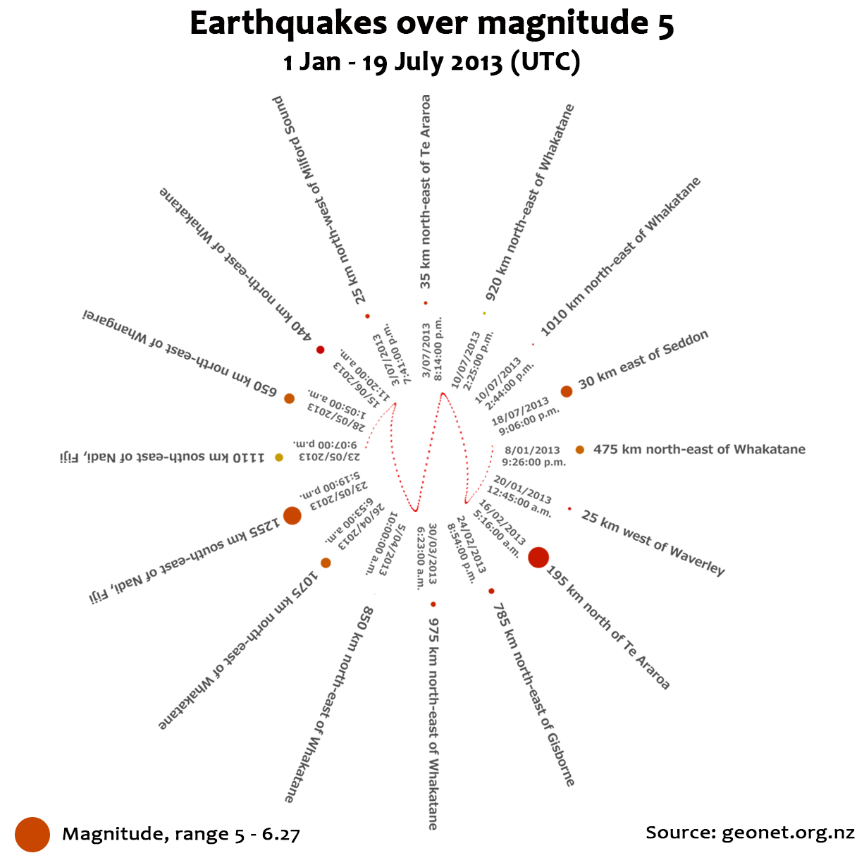
Spurred by this morning’s nasty bump near Wellington, and because I love me the learning of the new skills, I’ve made the graphic below. Using data I sucked down from geonet, it shows quakes of magnitude 5 or over which have happened in NZ this year. As you can see, it shows when (UTC, sorry), where, and the magnitude. You’ll notice this morning’s bump is featured!
I’m of course still tooling around in the background*, but I figured I should get this out in the meantime.
Huzzah!

* Trying to make a circular, animated sine wave with varying amplitudes is difficult, as it turns out (well, mostly because I’ve only just started learning, but yeah). Heh.
—–
UPDATE
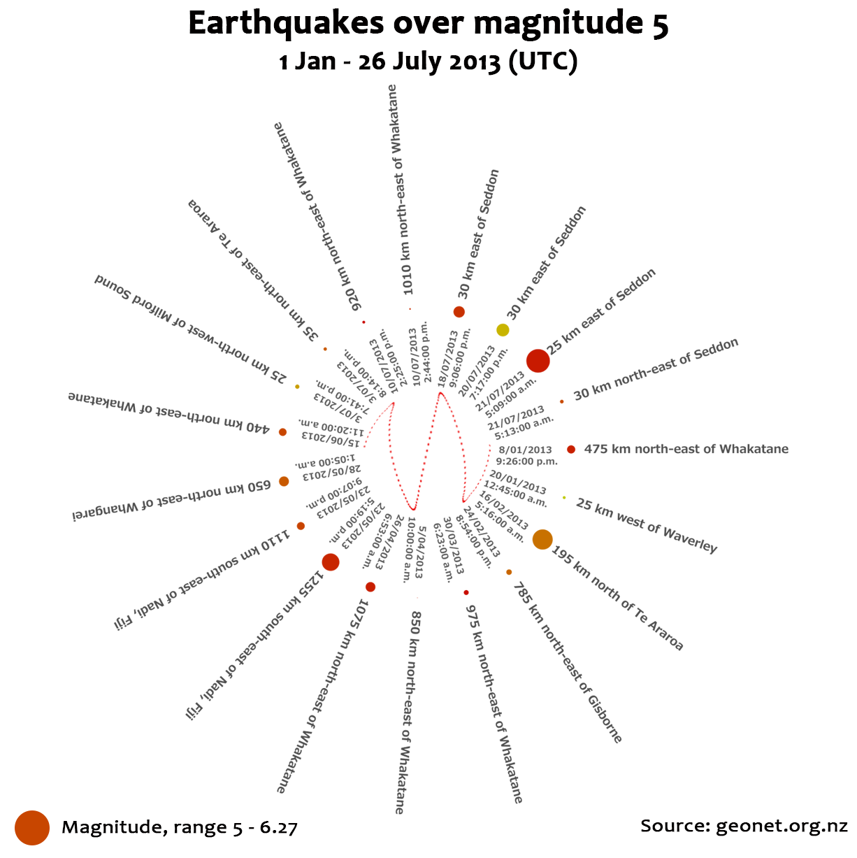
Well, everyone in NZ, certainly, knows about the bump on Sunday 21st. And, having given it a decent bit of time to see what happens next, I figured I’d update my visualisation. Can you spot the new quakes?
Clue – there are three new ones. Look for the biggest red dot :)
