Presents for your visual systems today… And we’ll be presenting two different people who’re merging science and visuals in new, and quite effective, ways.
I know I have a previous post somewhere (probably on my old blog) about engineering photos as well, but I thought I’d start afresh.
So, first up (because I saw it first), is this fantastic imagery, generated by acoustics engineer Mark Fischer (article here).
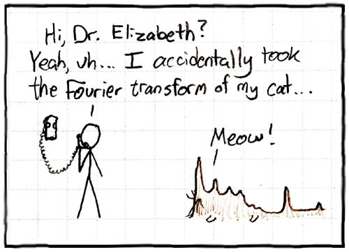
Fourier Transform (FT) maths is normally used to analyse sound. It has its limitations, however: it doesn’t handle more complex sounds very well, often turning elements into noise.
And a perfect example of these kind of complex sounds are the calls of whales and dolphins. And birds. So Fischer has begun using another method: wavelets. This is great - not only does it give a far more accurate and detailed map of the sounds/elements in the calls, but the pictures are perdy. Seriously. So perdy, in fact, that he’s able to sell them as art.
Hooray for interdisciplinarianism.
Up next is this. Again, one of those almost ‘duh’ moments, except you have to be a mathematician, a photograher, and a little bit on the artsy side to have the thought.
Still, it works. Nikki Graziano overlays graphs and their corresponsing questions onto photographs she’s taken which illustrate the equation/graph in question. Of course, the cool thing about being a mathematician is that she doesn’t need to draw the graph and then prowl the streets looking for an analogous image - instead, she’s able to take photos and then fit the maths to them.
Interesting stuff. I continue to be unimpressed that I’m not one of Nature’s mathematicians…

Pingback: Four short links: 3 February 2010 | Tech News From All Over The Net()
Pingback: Four short links: 3 February 2010 « Murder Manual()